Release 3.3
We're pleased to present Enterprise Lens 3.3, a milestone update and packed with new features to enrich your storytelling experience. These new features will elevate your Illustration creation and presentation experience.
What's New
- A new way to display values in boxes using Conditional Formatting, a powerful extension to our render engine that allows you to define conditions to format, aggregate and mutate attributes.
- Ability to effortlessly add associations with Automatic Filters and create lenses on the fly through Automatic Badges.
- Native support for Gantt Charts, to visualise project scheduling with ease.
- New Bulk Association Edit Ability that can be added to Roles, to control who can see the Associations menu.
- Choise based attributes now feature in-cell dropdowns when exported to Excel.
Features
1. Conditional Formatting
Overview
Conditional Formatting allows for the attributes presented in Lenses to be styled based on their value. This feature enables you to adjust the appearance of Lenses, such as Text Colour, Background Colour, Image Selection, and more, according to the data you already have in your illustration.
Some common examples of where you might want to use Conditional Formatting include:
- Ageing accounts receivable from customers according to their respective baskets, by colour coding each customers' box.
- Inventory levels for products, with a colour scheme to indicate level of depletion.
- Indicators to show per project to show the degree to which auditing standards are met.
- Customer satisfaction per sales representative, represented as a coloured percentage rating, according to internal standards.
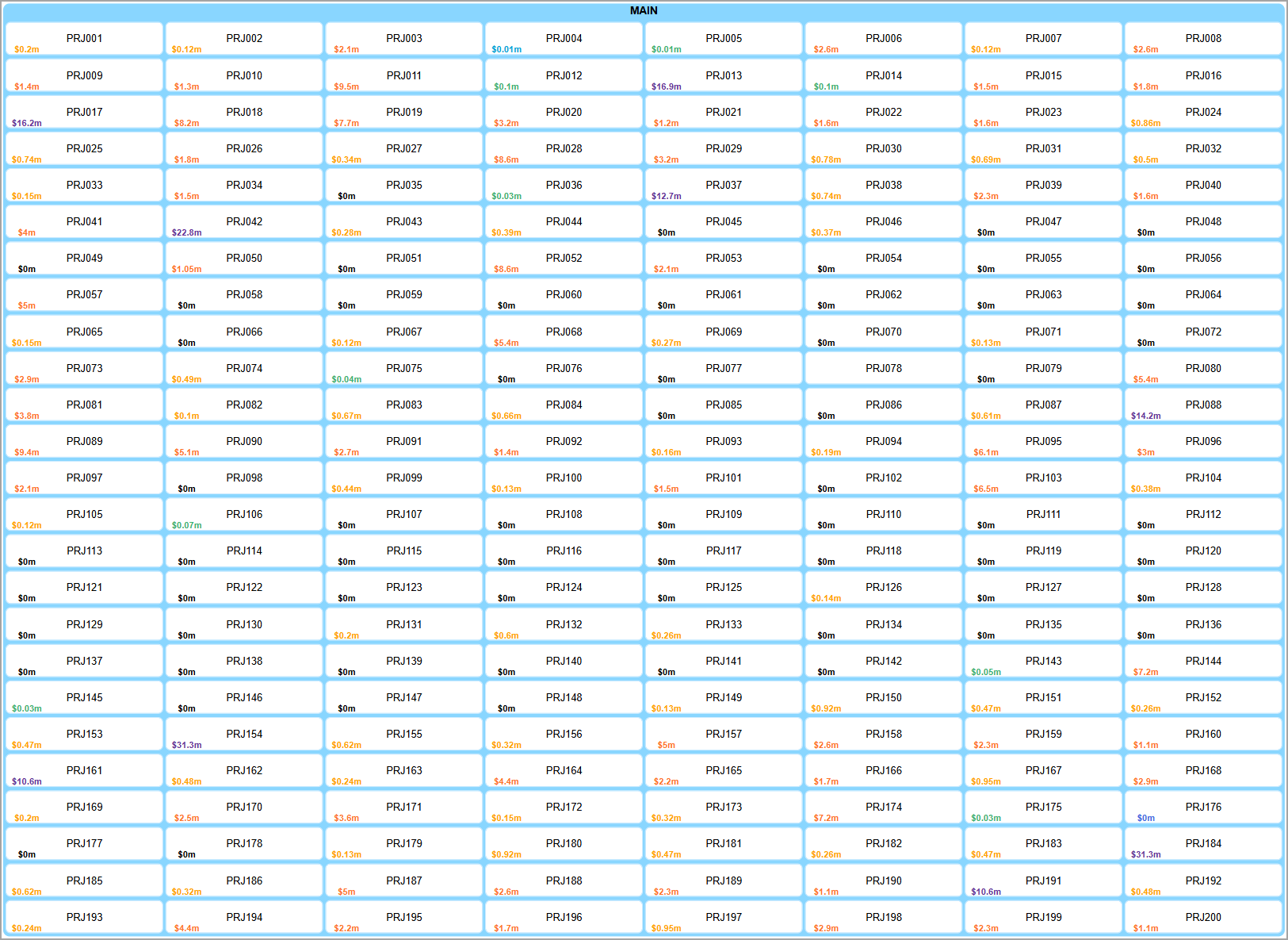
Below is an example of project costs, colour coded according to the amounts displayed.
How it Works
In order to create a Conditionally Formatted Lens, we need to create the Render Function inside the Attribute that we want to display, as seen above.
-
Open the
Editmenu for the respective Attribute.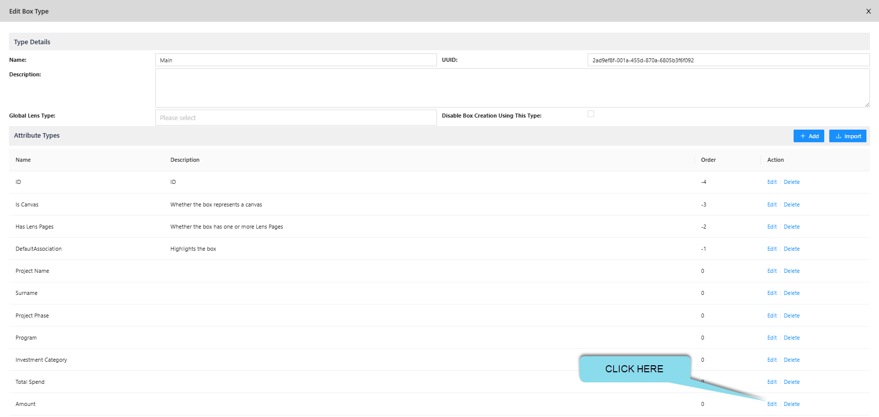
-
Open the default
Render Function. NOTE: It is important that the Value Type best represents what you are displaying. i.e. For Names, use Text, for Amounts, use Number.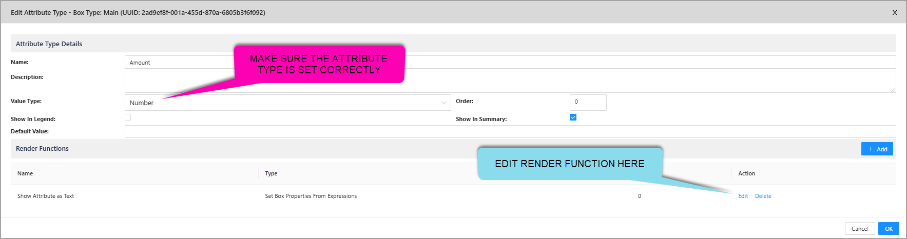
-
Copy and Paste a pre-set Conditional Formatting block from our Lens Library, to begin editing! The example below uses the Currency in Millions pre-set from our Lens Library.
IMPORTANT: Always make sure the Render Function UUID is copied into the
badgeTextAttribute.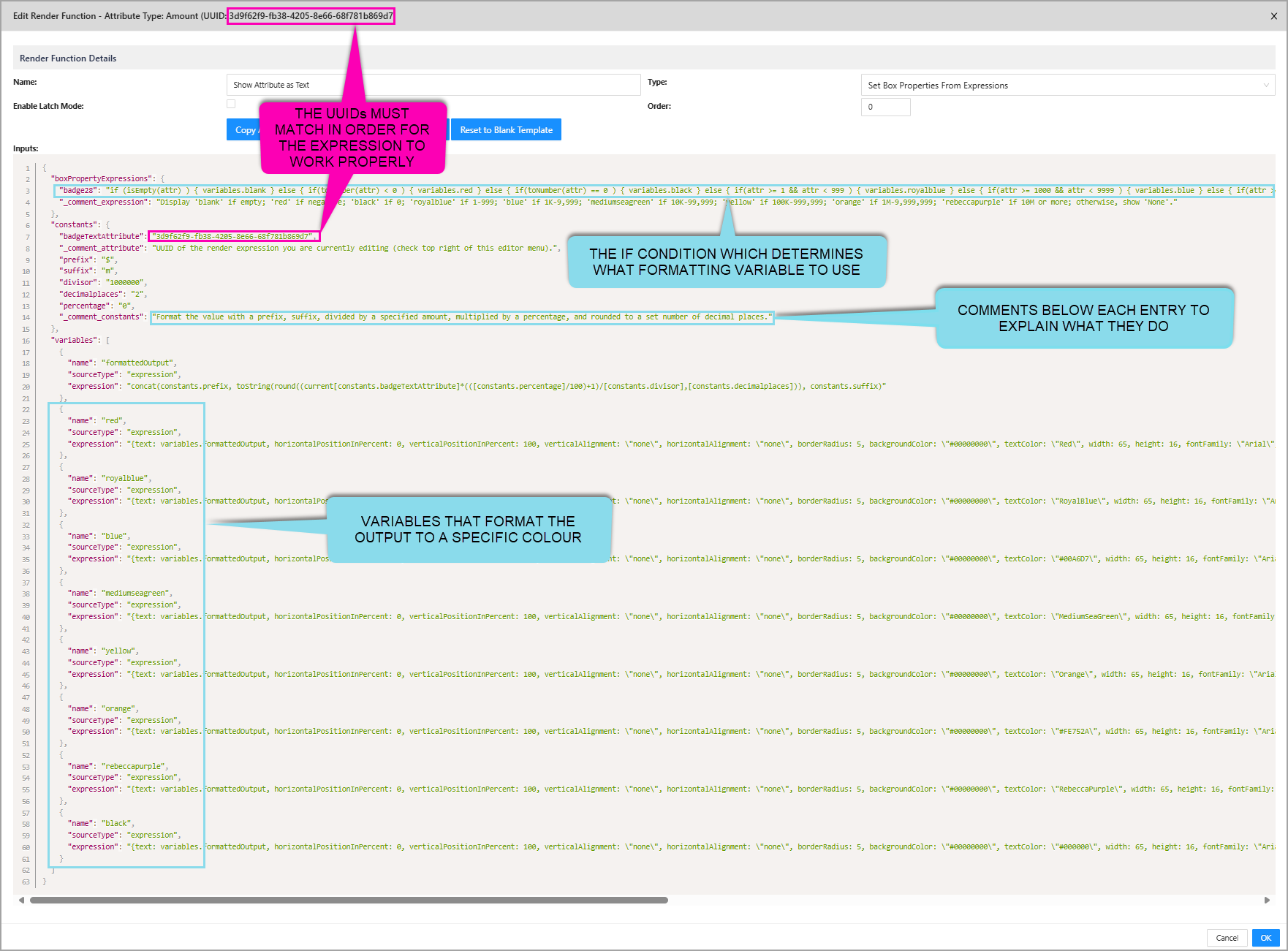
-
Create a Lens for the Attribute, to turn on and off the Conditional Formatting! :)
Use Cases
In addition to changing the colour or display of attributes, there are many other capabilities that Conditional Formatting can bring to your Illustration. These are all readily available through our Lens Library for you load and edit to your liking.
1.1. Arithmetic
You are able to add prefixes and suffixes, as well as apply basic mathematics to your attributes with the use of variables. Let's take a closer look at the previous example to see how it can be done.
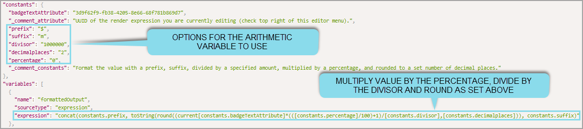
Here we can see the formattedOutput variable referencing the constants above it. These constants all affect the attribute's value displayed.
There are several important things to note:
- Every constant referenced must have
constants.in front of the name. i.e.constants.percentage - To reference the attribute's value, you must use the
badgeTextAttributeconstant, which you can see has all the multiplication (*) and division (/) applied to it. concat()allows you to merge items together.- In this example, the prefix and suffix are added before and after the rounded, divided, and multiplied attribute value.
- Another example using just concat is:
concat(x, y, z)which would displayxyz.
round()allows you to round anything to a set number of decimal places.- In this example, the attribute value is rounded according to
constants.decimalplaces, which we defined earlier as2. - Another example using just round is:
round(100.2927, 2)which would display100.29.
- In this example, the attribute value is rounded according to
If the attribute's value was 1000000.112...
Let's break down the arithmetic example above, going inside out.
Remember: The values we use to divide, multiply, etc are taken from the constants above!
- First, the value will be multiplied by
(0/100)+1which is1.- Value would still be
1000000.112.
- Value would still be
- Second, the value will be divided by
10000000.- Value becomes
1.000000112.
- Value becomes
- Thirdly, the value will be rounded to 2 d.p.
- Value becomes
1. - No trailing zeroes are shown when rounding.
- i.e. 5.10 becomes 5.1
- Value becomes
- Finally, the value is concatenated with its prefix and suffix.
- Value becomes
$1m.
- Value becomes
Here is a table with a list of all Operators you may wish to use.
| Operator | Description |
|---|---|
/ | Division. i.e. 4/2 would display 2. |
// | Rounded division. i.e. 5//3 would display 1. |
* | Multiplication. i.e. 4*2 would display 8. |
+ | Addition. i.e. 4+2 would display 6. |
- | Subtraction. i.e. 4-2 would display 2. |
1.2. Rolled Up Aggregation
In addition to formatting existing values, you may want to count or add values together to display above, this is where you can use Conditional Formatting to aggregate values.
The example below is displays a Count of Projects, Sum of Project Costs, and Total People per Project (from left to right).

These values do not exist in our data, we are creating it using a Render Function in a new attribute.
- This way, we do not need to update the attribute's value, the Render Function automatically handle this for us.
Below is what the Render Function looks like for the Count of Projects, which is included in the Lens Library.
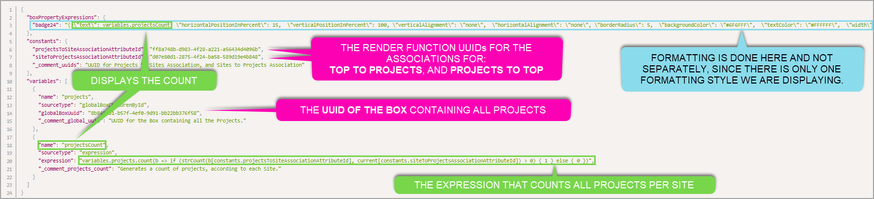
Here Conditional Formatting is still used, but in a different manner:
- The formatting is done in the badge because we want to display a count with consistent formatting across all sites.
variables.projectsCountis referenced as the text value, since this variable does all the counting.- Several UUIDs need to be defined, to establish the association and the box that holds all projects.
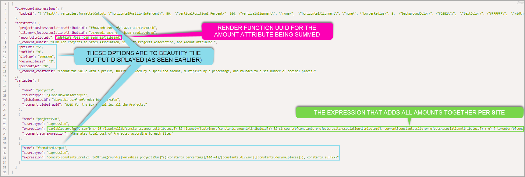
This format is near identical for the Sum of Project, with the only changes being:
- The sum's variable name and expression.
- A new UUID to define which attribute to add together.
- Additional options to beautify the output (as seen earlier).
See below for an example.
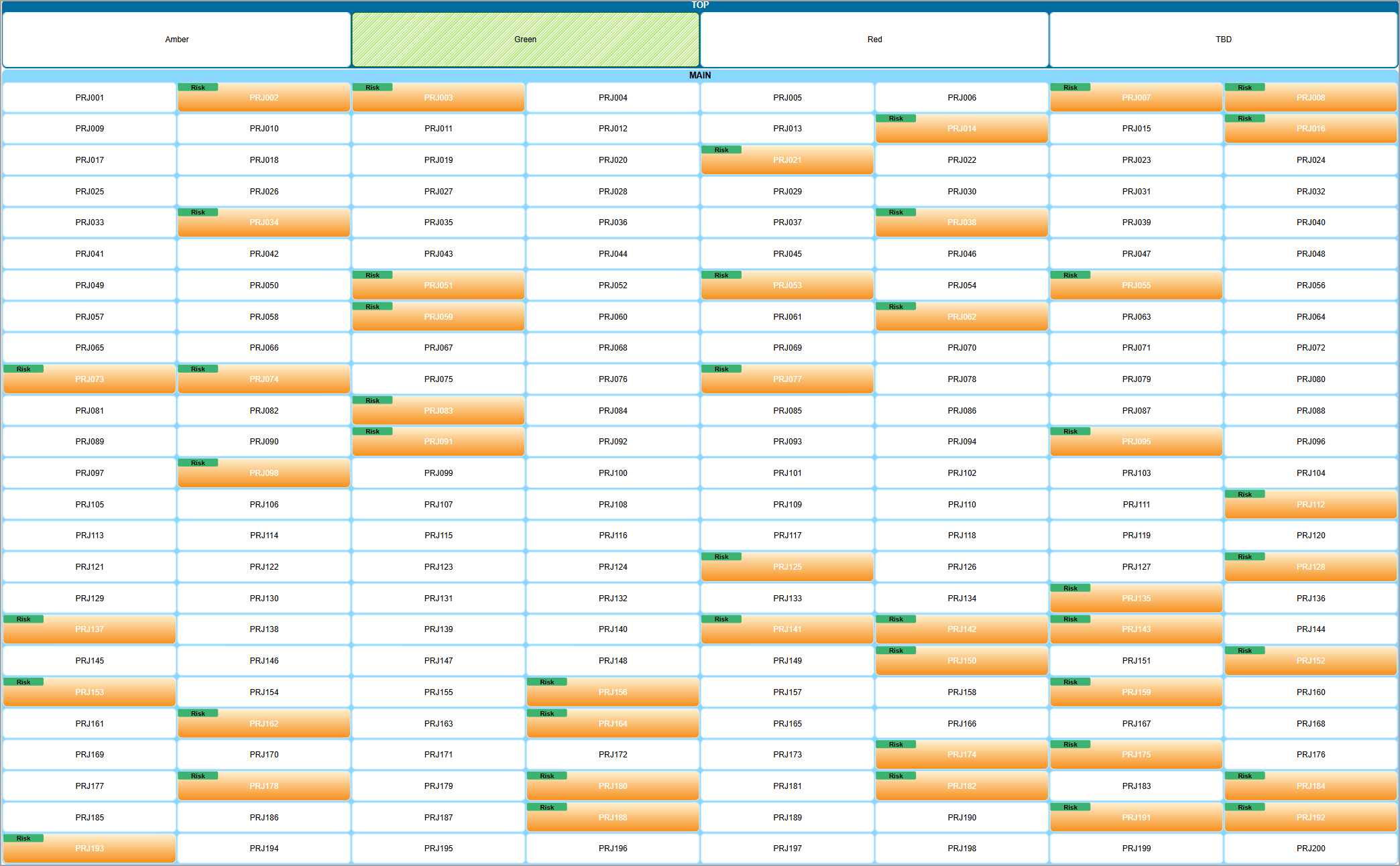
1.3. Gantt Charts
To quickly visualise projects or other deliverables, you may wish to utilise the Gantt Chart Conditional Formatting Lens, available in our Lens Library. Below is an example showcasing several projects, automatically resized to show their duration.
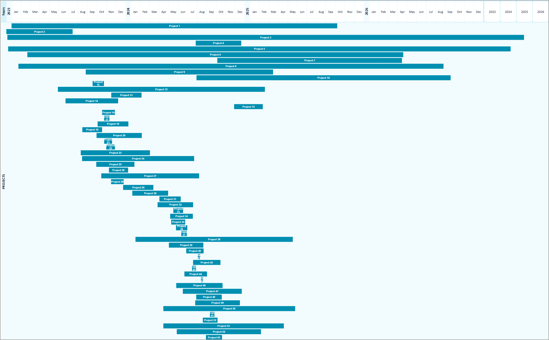
Like Rolled Up Aggregation, you need a new attribute to store the Render Function, in addition to this you need a startDate and endDate attribute within the same Box Type in order for it to calculate correct sizes. Below is the same example's Render Function.
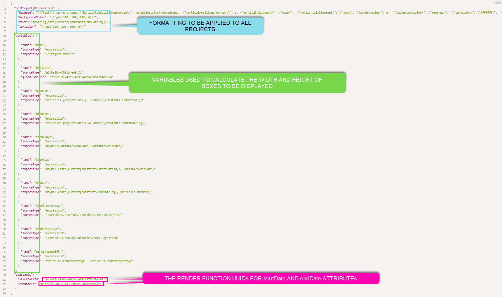
IMPORTANT: Beyond the backgroundColor, textColor box properties and startDateid, endDateid constants, we do not recommend anything else be changed to ensure a consistent and reliable experience.
2. Automatic Filters
Associations are the essential foundation for Enterprise Lens' functionality since Day 1, which makes us exceptionally excited to share this new feature with you. Normally what would take a few minutes can now be achieved in a few seconds. Below is a typical association, created as an Automatic Filter.
The badge you see below will be explained shortly.
How it Works
-
Open the box you wish to add your Automatic Filters, in this example we used the Top Box.

-
Click + Create Automatic Filters to open the wizard. Here are all the options available to you.

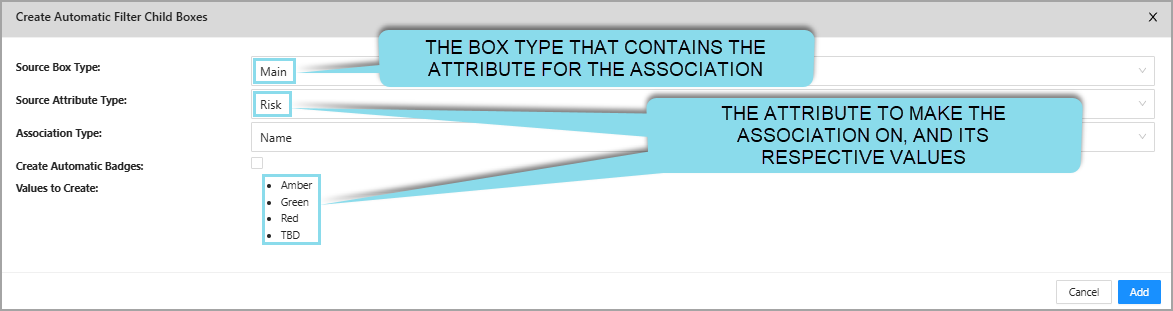
-
Click Add, to confirm.
The table below explains each option into more detail.
| Options | Description |
|---|---|
| Source Box Type | This is the Box Type that contains the Attributes you want to import as the children boxes. |
| Source Attribute Type | This is the Attribute you will select to import.Every choice available in this attribute type will be shown below as a list. |
| Create Automatic Badge | Creates Automatic Badges, which will be explained in the next section. |
| Association Type | This is where you distinguish whether you want to create an Attribute or a Name Association. We recommend choosing Name Association, because it provides the greatest flexibility. If any of the Attribute Values were to change, all you need to do is rename the corresponding box. i.e. TBD becomes N/A, I rename the TBD box to N/A - simple! |
| Values to Create | Shows you the list of values it will create as child boxes within the box you selected in Step 1. |
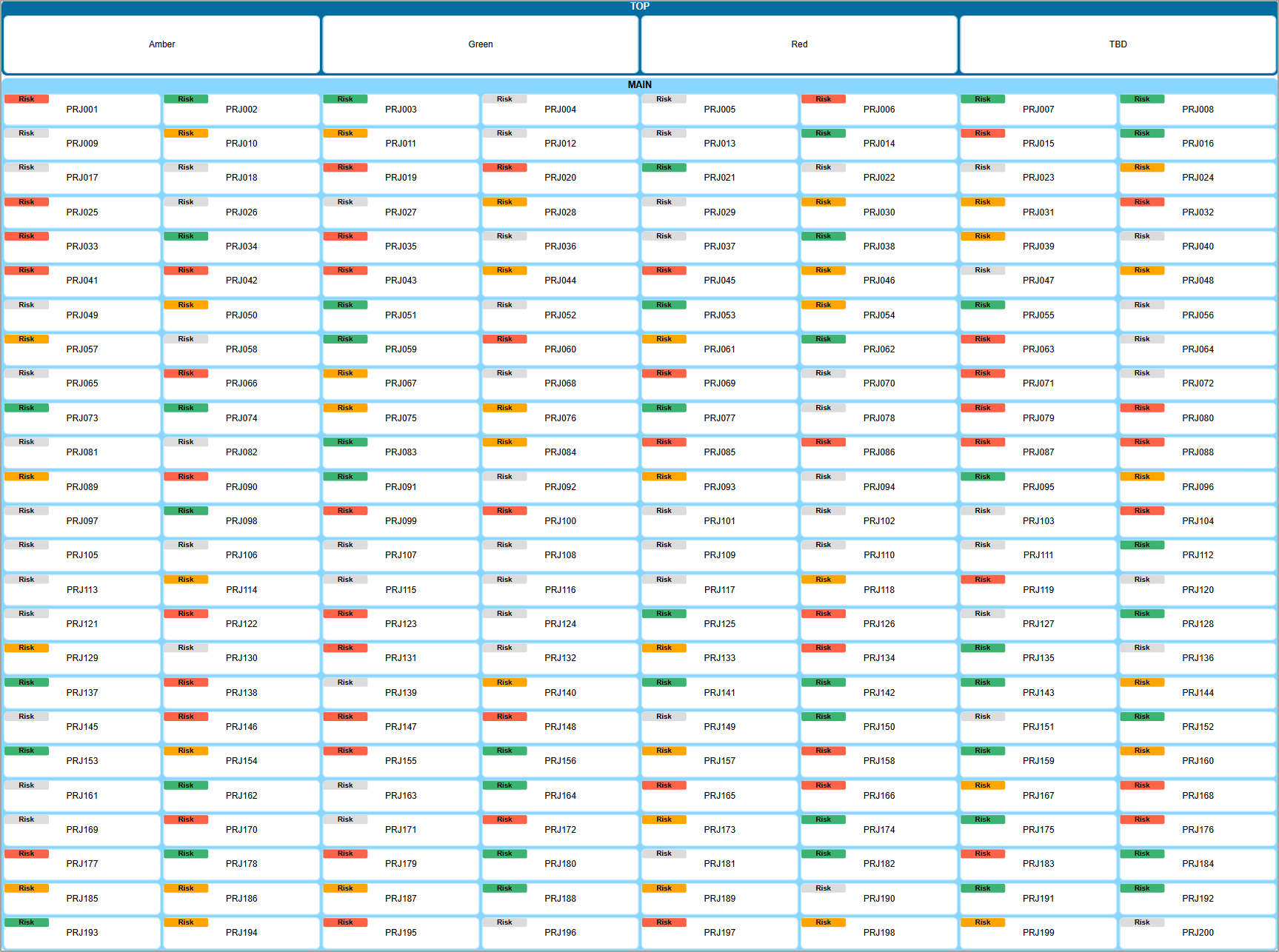
3. Automatic Badges
Instead of editing Render Functions or creating Lenses separately, you can create the badges automatically and customise them on-demand in just a few seconds, all made possible by the Automatic Filters feature!
Pictured below is the same Automatic Filter, however with an Automatic Badge.
How it Works
In the same Automatic Filters Wizard, simply select the Create Automatic Badges checkbox as pictured below.
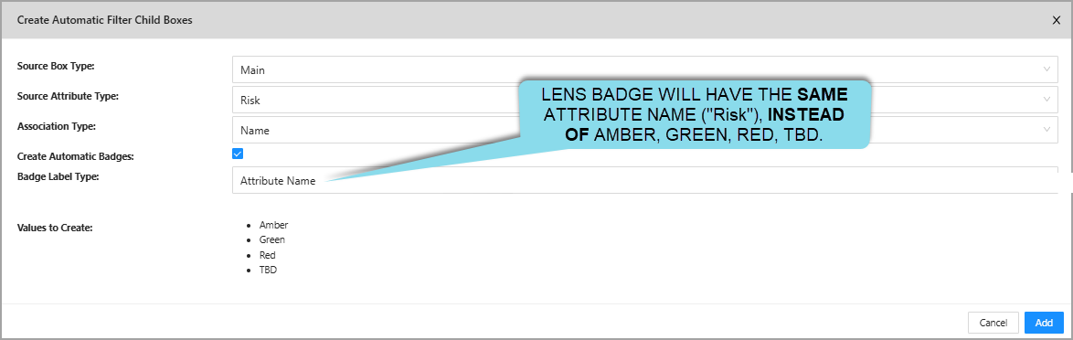
Instead of 'Red', 'Amber', 'Green', and 'TBD', we have opted to display 'Risk' for the badges and colour code them instead. This is because we selected Attribute Name, by default it is Attribute Value.
The table below explains each of the new options with more detail.
| Options | Description |
|---|---|
| Create Automatic Badges | If toggled, creates the Dynamic Lens. |
| Badge Label Type | You have two options. 1. Attribute Name - uses the Attribute Name. i.e. Risk. 2. Attribute Value - uses the names from Values to Create. i.e. Red, Amber, Green, TBD. |
Power Lenses are created automatically in the Left Hand Menu for you to hide and show each listed value.
How to Customise
By default, all badges will be grey, this is very quick and painless to update to a colour of your choosing.
- Click on a newly-created child box, in this example we are using
Amber(as seen earlier).
- Edit
Filter.Background Colorto the colour of your choice. In this example, we enteredorange, however any [HTML colours][HTML Color Names (w3schools.com)] or HEX colour codes are accepted.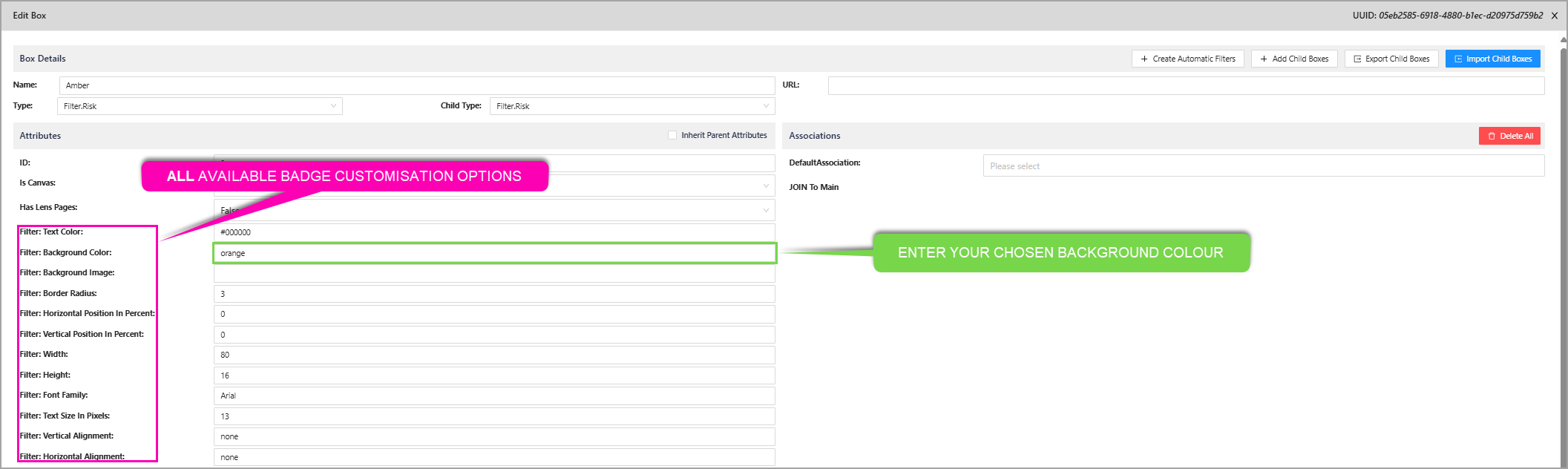
- Repeat this for all attribute values, by clicking on their respective child box.
The colours we used were, Tomato (Red), Orange (Amber), and MediumSeaGreen (Green) which are all HTML colours.
Here is a list of all options you can use per value (child box), which apply to all boxes with the same attribute value!
| Option | Description | Default Value |
|---|---|---|
Filter.Text Color | The colour for the badge's text. | #000000 (black) |
Filter.Background Color | The colour for the badge's background. | #DCDCDC (grey) |
Filter.Background Image | The background image for the badge. | (empty) |
Filter.Border Radius | The padding around the badge. | 3 |
Filter.Horizontal Position In Percent | How far left or right (horizonal) the badge should be within the box, as a percentage. i.e. 50 would mean it is in the middle on the horizontal axis. | 0 |
Filter.Vertical Position In Percent | How far up or down (vertical) the badge should be within the box, as a percentage. i.e. 50 would mean it is in the middle on the vertical axis. | 0 |
Filter.Width | How wide the badge should be, in pixels. | 80 |
Filter.Height | How tall the badge should be, in pixels. | 16 |
Filter.Font Family | The font of the text in the badge. | Arial |
Filter.Text Size in Pixels | How large the text should appear within the box. | 13 |
Filter.Vertical Alignment | Whether the badge should be vertically aligned inside the box. | none |
Filter.Horizontal Alignment | Whether the badge should be horizontally aligned inside the box. | none |
3.1. Automatic Power Lenses
In order to Show and Hide Automatic Badges, you can use the Power Lenses created earlier. Below is an example of this, with the Risk Dynamic Lens.
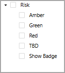
Below is a breakdown of all the Power Lenses automatically generated for you.
| Type | Definition | Example (as seen above) |
|---|---|---|
| Attribute Values | For each unique value of the attribute, a Power Lens is made to turn their respective badges on and off. Turning on any one of them will hide all the boxes that contain other badge types. | AmberGreenRedClicking on each of them will hide it's associated badge. |
| Display the Badges | Allows you to enable the Dynamic Lens when other Power Lenses are used | Show Badge |
Below is an example of the Amber Power Lens and Show Badge turned on.
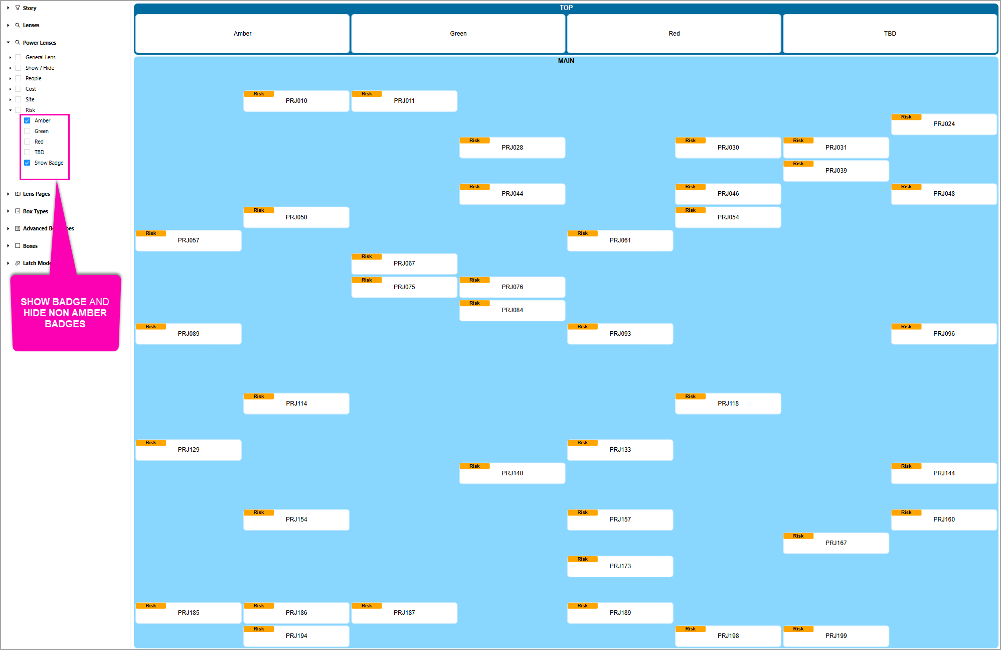
As you can see, it only shows boxes with the Amber badge, while displaying the Badge too.
4. Custom Templates
This features is a refinement of templates and provides the ability to setup industry and company specific templates and facilitates simple replication. This allows access to a library of templates that are simple to access and can be tailored to new opportunities, improving the speed to respond to new business.
This new functionality is found by editing the Client, in the right-hand side of the form. Click Edit to open the Edit Client form.
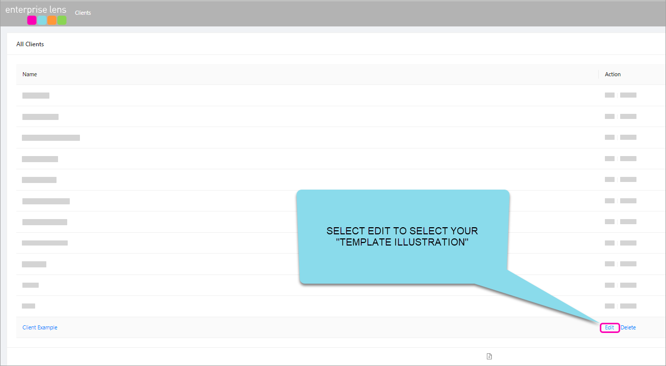
When you click Edit it will present the Client Details form. Use the drop down arrow to provide a list of Template Clients you can choose from (this will be determined by your access privileges).
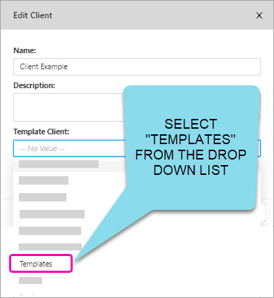
After selecting a Template Client, (we selected Template from the example above) - all Template Projects (Directories) that belong to that Client will appear in the drop down list in the Template Project area
- Selecting a
Template Projectwill result in all the Template Illustrations that are part of that Template Project to present themselves whenever you create ANY new Illustration for that Client.
Every Client can have their OWN Templates to Choose from or you can build a central repository.
5. New Bulk Association Edit Ability
With the addition of data driven lookups (such as the Name value and the Attribute Value lookup), the need for access to the Assocations Menu has decreased. The new role, IllustrationBulkAssociationEdit, allows you to hide the Assocations Menu, as to free up space in the Right Hand menu.
NOTE: The IllustrationBulkAssociationEdit role must be included in the group role that you would like to be able to delete Associations.
The Assocations Menu is located at the bottom of the Right Hand Menu.
This entire section can be removed with the new role.
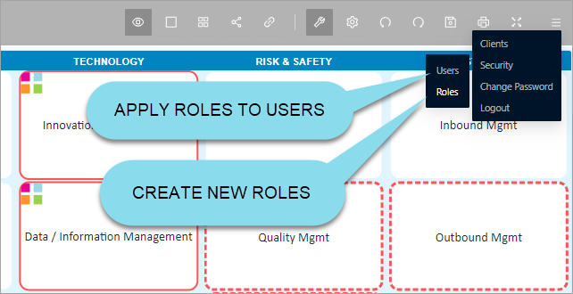
To access Roles within Enterprise Lens, simply click on the 3 dashes in the top right hand corner and select Security -> Roles, as below.
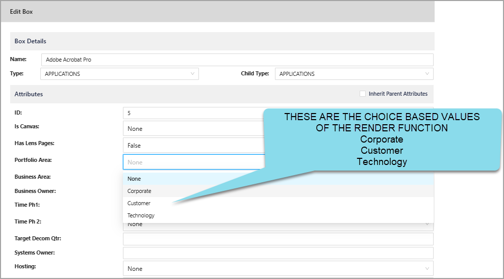
6. In-cell dropdowns now available in Exports to Excel
Attributes have always supported being choice-based, meaning their values can be restricted to a predefined list. This ensures consistency and simplifies data entry by limiting input to a set of valid options, as pictred below.
This dropdown is now featured in Excel spreadsheets when you Export boxes in all modes of export, including:
- Exporting Child Boxes
- Export Canvases
- Export whole illustrations to Excel
Below is the same illustration used above, exported to Excel. You can see the same Portfolio Area attribute as an in-cell dropdown, which reflects the choice-based nature of the attribute shown above.
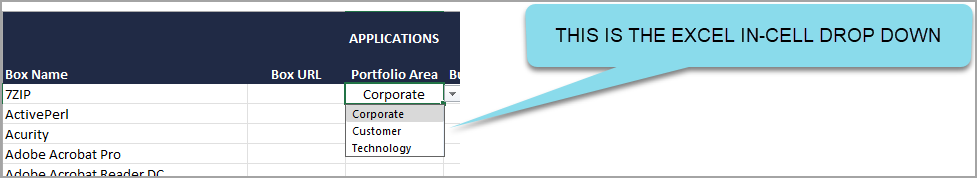
You are able to change the value using the dropdown in Excel which can then be reimported into Enterprise Lens.
Jira Codes
Bug
EL-700 Allow expressions to set badges
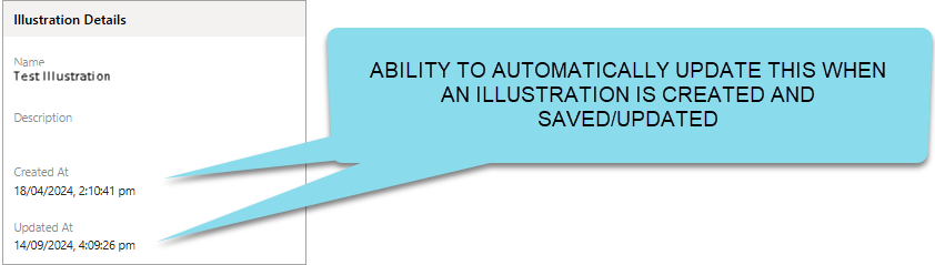
EL-718 Update the Illustration Details value: Created At and Updated At
New Feature
EL-699 SUM calculations based on Associations highlighted
EL-702 Conditional Formatting
EL-703 Gantt Chart functionality
EL-716 Automatic Badges
EL-717 In-cell drop when exporting to excel from a Box Type Expression
Improvement
EL-308 Legends
EL-698 Extend Values and Values Reverse Lookups
EL-701 New Default Template
EL-722 Improve the UX experience during the creation of a Dynamic Lens from Create Automatic Filters
EL-732 Change Name Association Behaviour when using "Create Automatic Filter"
EL-733 Remove the default text render function from automatically created badges
EL-742 Hide existing render functions when creating automatic filters
EL-743 Consolidate the Show/Hide Badge Power Lenses to a singular Power Lens when creating Automatic Badges
EL-744 Newly created automatic badges should be turned on in Power Lenses, not Advanced Box Types
EL-745 Update GitHub Upload Artifacts from v3 to v4