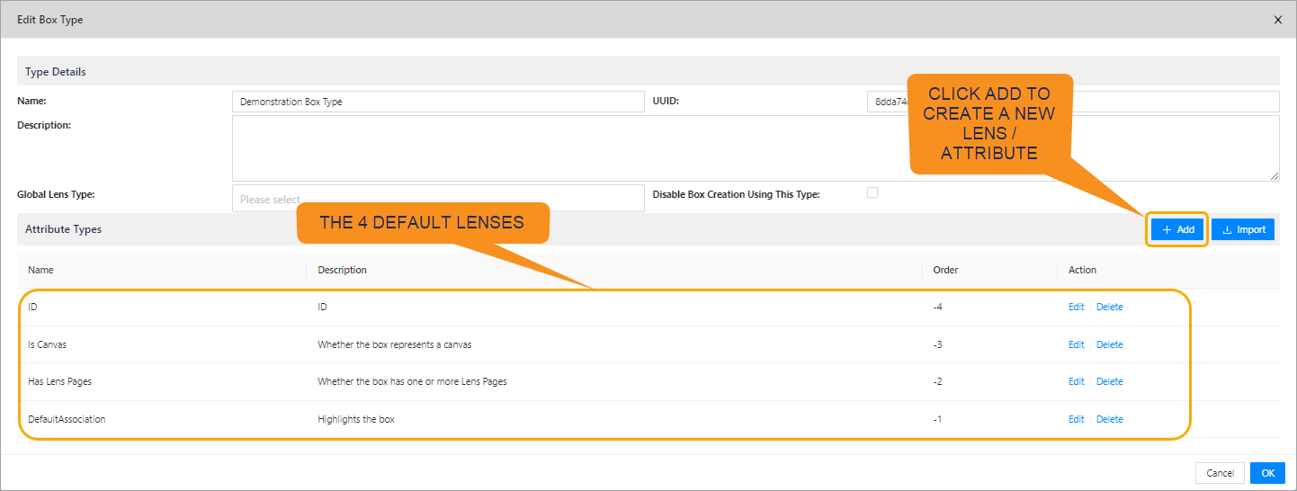
Lenses
This guide will provide a brief overview of lens attributes, and how they work to form lenses.
Lens Attributes
In this section we will talk about the commonly used, what they are and how to configure them.
Note, when the attribute is a VALUE TYPE = CHOICE, then it needs some special treatment and uses escape characters to set values that are "strings". This is in the attribute name and it can also be in the attribute value.
Note that camel case is used as it is the preferred syntax for the Enterprise Lens engine. An example of camel case is the "textAlignmentPaddingInPixels" attribute.
| LENS ATTRIBUTE | WHAT IT DOES | SAMPLE VALUES | VALUE TYPE = TEXT | VALUE TYPE = C |
|---|---|---|---|---|
| text | This is free form text and you can enter any type of text, numeric, alphanumeric, extended characters | This is a sample 1,2,3,4,5 $ of what you could enter! | "text": "This is a sample 1,2,3,4,5 $" | {\"text\": \"This is a sample 1,2,3,4,5 $ of what you could enter!\"} |
| textAlignment | This attribute lets you aling text to the left, centre or right. it also caters when you have turned the text vertical top, centre, bottom. | start, center, end | textAlignment": "start" | {\"textAlignment\": \"start\"} |
| textAlignmentPaddingInPixels | This determines the number of pixels the text should have from the start or end. The default is 8 pixels | Any whole number | "textAlignmentPaddingInPixels": 12 | {\"textAlignmentPaddingInPixels\": 12} |
| attributeType | This selects the attribute that you would like to use | Attribute UUID | "attributeType": "e173195b-6363-4b30-9b04-63c5b7b07d30" | "attributeType": "e173195b-6363-4b30-9b04-63c5b7b07d30" |
| alternativeAttributeTypeSource | You can use values from another attribute to provide input to this attribute | Attribute UUID | "alternateAttributeTypeSource": "0cbf4700-ec00-4fa1-bc2c-df7ded72c628" | "alternateAttributeTypeSource": "0cbf4700-ec00-4fa1-bc2c-df7ded72c628" |
| horizontalPositionInPercent | This determines the horizontal starting position for a Lens | Any whole number from 1..100. 0=Left side, 50=Middle, 100=Right side | "horizontalPositionInPercent": 0 | {\"horizontalPositionInPercent\": 0} |
| verticalPositionInPercent | This determines the vertical starting position for a Lens | Any whole number from 1..100. 0=Top, 50=Middle, 100=Bottom | "verticalPositionInPercent": 0 | {\"verticalPositionInPercent\": 0} |
| verticalAlignment | This determines the vertical alignment of the lens | none, center, left, right | "verticalAlignment": "none" | {\"verticalAlignment\": \"none\"} |
| horizontalAlignment | This determines the horizontal alignment of the lens | none, top,center,bottom | "horizontalAlignment": "none" | {\"horizontalAlignment\": \"none\"} |
| textColor | This determines the text color for the Lens and can be a Hex code or the name of the color | #FFFFFF, White, #000000, Black | "textColor": "White" "textColor": "#FFFFFF" | {\"textColor\": \"White\"}{\"textColor\": \"#FFFFFF\"} |
| backgroundColor | The determines the background color of the Lens and can be a Hex code or the name of the color | #FFFFFF, White, #000000, Black | "backgroundColor": "Black" "backgroundColor": "#000000" | {\"backgroundColor\": \"White\"}{\"backgroundColor\": \"#FFFFFF\"} |
| borderRadius | This determines how "round" the edges of the box are, the larger the number the more round the box edges | Whole Number | "borderRadius": 5 | {\"borderRadius\": 5} |
| borderSizeInPixels | This determines the thickness of the box border | Whole Number | "borderSizeInPixels": 5 | {\"borderSizeInPixels\": 5} |
| borderColor | This determines the color of the border | #FFFFFF, White, #000000, Black | "borderColor": "Black" "borderColor": "#000000" | {\"borderColor\": \"White\"}{\"borderColor\": \"#FFFFFF\"} |
| borderStyle | This determines the type of box border | solid, dashed, ridge, inset, offset, dotted, groove, double | "borderStyle": "dashed" | {\"borderStyle\": \"dashed\"} |
| width | This determines how wide the Lens is. It can be a size in Pixels or it can be a percentage of the entire width of the box | a number (of pixels) or a percentage | "width": 20 "width": 20% | {\"width\": 20}{\"width\": \"20%\"} |
| height | This determines how tall the Lens is. It can be a size in Pixels or it can be a percentage of the entire height of the box | a number (of pixels) or a percentage | "height": 20 "height": 20% | {\"height\": 20}{\"height\": \"20%\"} |
| fontFamily | This is the font that you wish the Lens to be displayed in. | Primary supported font types | "fontFamily": "Arial" | {\"fontFamily\": \"Arial\"} |
| textSizeInPixels | This determines the size of the text | Number | "textSizeInPixels": 14 | {\"textSizeInPixels\": 14} |
| layoutWeight | This determines the percentage that this particular box should have amongst its peers. Note, there are "" around the layoutWeight | Any whole number that represents 1.100% | "layoutWeight": "20" | {\"layoutWeight\": \"20\"} |
| childLayout | This determines the layout of the children within a box and it mimics the direction controller. Boxes can be either Vertical, Grid or Horizontal. Note, grid is determined by the Typewriter setting | horizontal,vertical,grid | "childLayout": "grid" | {\"childLayout\": \"grid\"} |
| fontWeight | This determines is the text is normal or bold | normal, bold, bolder, lighter | "fontWeight": "bold" | {\"fontWeight\": \"bold\"} |
| textIsVertical | This determines is the text is positioned horizontal along the Lens or on its side (vertically). Note, there are no "" around true. | false,true | "textIsVertical": "true" | {\"textIsVertical\": true} |
Types of Lenses
This section will detail the different types of Lenses their are and the associated JSON code the accompanies them. First, we will go through the different Types of Lenses there are. Essentially, there are two types of Lenses TEXT and CHOICE.
- TEXT is free form Text where you manually enter the value you want to appear in the Lens
- CHOICE is a lookup list, where the only value the Lens can select is from the Drop down
Lets look at the 4 different styles of Lenses
1. Text - Free Form (place the text directly below the box name)
This is the default Lens for importing new column data from Excel. When you turn on this Lens, it places the data directly below the box name
Set the VALUE TYPE to TEXT
{
  "boxPropertyKey": "text"
}
2. Text - Free Form (position where you place the free form text)
This is a free form Text Lens but you can place the data where ever you would like within a Box.
Set the VALUE TYPE to TEXT
Where the attributeType is the UUID of the LENS
{
  "attributeType": "e173195b-6363-4b30-9b04-63c5b7b07d30",
  "horizontalPositionInPercent": 0,
  "verticalPositionInPercent": 50,
  "verticalAlignment": "none",
  "horizontalAlignment": "none",
  "textColor": "#FFFFFF",
  "backgroundColor": "#202a45",
  "borderColor": "#FFFFFF",
  "borderRadius": 5,
  "borderSize": "1",
  "borderSizeInPixels": "1",
  "borderStyle": "",
  "width": 35,
  "height": 25,
  "fontFamily": "Arial",
  "textSizeInPixels": 13
}
3. Single Render Function (position where to place the Text or Image)
This is the default Lens for importing new column data from Excel.
Set the VALUE TYPE to CHOICE
{
  "Light": {
    "boxPropertyKey": "badge1",
    "boxPropertyValue": "{\"horizontalPositionInPercent\": 0, \"verticalPositionInPercent\": 50, \"borderRadius\": 6,  \"widthInPixels\": \"92%\", \"heightInPixels\": \"92%\", \"backgroundImage\": \"radial-gradient(transparent, #b3e5fc 100%)\" }"
  },
  "Dark": {
    "boxPropertyKey": "badge1",
    "boxPropertyValue": "{\"horizontalPositionInPercent\": 0, \"verticalPositionInPercent\": 50, \"borderRadius\": 6,  \"widthInPixels\": \"92%\", \"heightInPixels\": \"92%\", \"backgroundImage\": \"radial-gradient(transparent, #01579b 100%)\" }"
  },
  "Red": {
    "boxPropertyKey": "badge1",
    "boxPropertyValue": "{\"horizontalPositionInPercent\": 0, \"verticalPositionInPercent\": 50, \"borderRadius\": 6,  \"widthInPixels\": \"92%\", \"heightInPixels\": \"92%\", \"backgroundImage\": \"radial-gradient(transparent, #FF0000  100%)\" }"
  }
}
4. Multiple Render Function (position where you place the Text or Image)
This Lens is made up of 4 components that: set the Box text color; places a border around the box; sets the backround color and places the word "critical" in the top left corner of the box.
Set the VALUE TYPE to CHOICE
Set the Text Color
{
  "Yes": {
    "boxPropertyKey": "textColor",
    "boxPropertyValue": "#FFFFFF"
  }
}


Set the Border Color
{
  "Yes": {
    "boxPropertyKey": "borderColor",
    "boxPropertyValue": "#FF0000"
  }
}

Set the background Color
{
  "Yes": {
    "boxPropertyKey": "backgroundColor",
    "boxPropertyValue": "#202a45"
  }
}

Place the word "Critical" in the Top Left corner of the Box
{
  "Yes": {
    "boxPropertyKey": "badge2",
    "boxPropertyValue": "{ \"text\": \"Critical\", \"horizontalPositionInPercent\": 0, \"verticalPositionInPercent\": 0, \"verticalAlignment\": \"none\", \"horizontalAlignment\": \"none\",\"borderRadius\": 5, \"backgroundColor\": \"#ff0000\", \"textColor\": \"White\", \"widthInPixels\": 55, \"heightInPixels\": 16, \"fontFamily\": \"Arial\", \"textSizeInPixels\": 13 }"
  }
}
5. Adding a Lens BMc
We will go through adding a Lens.